What is a PRISMA Flow Diagram? Purpose, Phases and Benefits


A PRISMA flow diagram is a figure that records how many records a systematic review found, how many were removed at each stage, and why, so a reader can trace every included study back to the original search.
The PRISMA 2020 flow diagram is one component of PRISMA 2020, alongside the 27-item checklist and other supporting reporting materials. The checklist specifies reporting items for the review, while the flow diagram provides a concise way to report the numbers and reasons involved in study selection. This guide covers what the diagram is for, what every box in the official template contains, the three units it counts in, and what having a good one actually buys you [1].
Key Takeaways
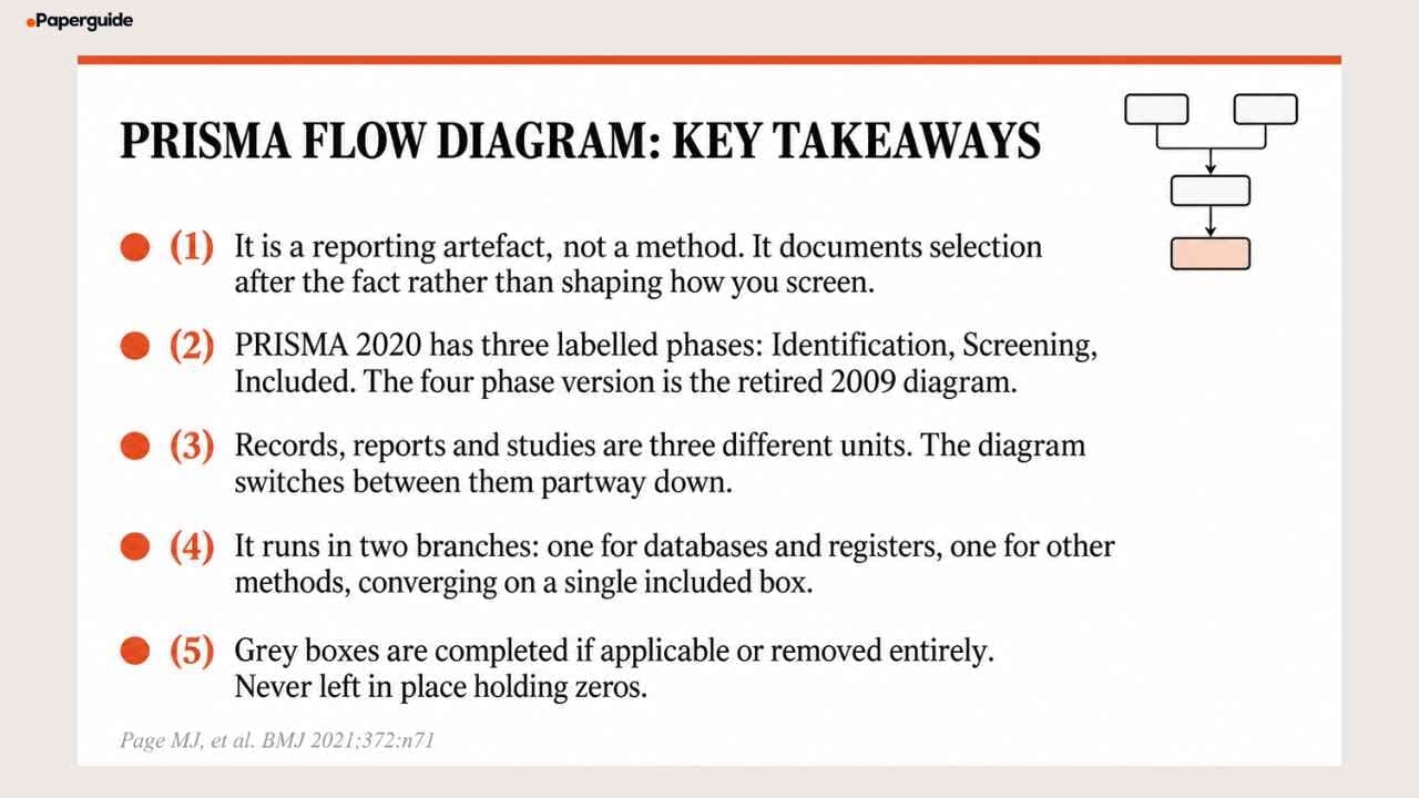
- It is a reporting artefact, not a method. It documents selection after the fact rather than shaping how you screen [1]
- PRISMA 2020 has three labelled phases: Identification, Screening, Included. The four phase version is the retired 2009 diagram [2]
- Records, reports and studies are three different units, and the diagram switches between them partway down
- It runs in two branches, one for databases and registers and one for other methods, converging on a single included box
- Grey boxes are completed if applicable or removed entirely, never left in place holding zeros [1]
What the Diagram Is For
The diagram answers one question: can a reader reconstruct how you got from thousands of search results to these few included studies?
Every box exists so somebody downstream can answer a sub question without emailing you. An editor deciding whether your screening was proportionate. A peer reviewer checking whether your exclusion reasons are credible. Another research team deciding whether your review is worth updating and where to restart the search.
That framing explains why the diagram is a reporting requirement rather than a methodological one. It does not tell you how many reviewers should screen or how to build a search string. It tells you that whatever you did, the numbers have to be visible. The wider distinction between reporting and conduct is one reason PRISMA is classified as a reporting guideline rather than a methods standard.
Benefits of a PRISMA Flow Diagram
The diagram is often treated as a submission formality. It earns its place for five reasons.
It makes attrition visible. A review that screens 2,400 records and includes 6 studies is telling a different story from one that screens 90 and includes 6. The diagram forces that ratio into the open, where it belongs.
It exposes reporting gaps before a reviewer does. If your "reports not retrieved" box holds 40 papers, a reader will ask what those were and whether they might have changed the conclusions. Far better to answer that in the manuscript than in a revision round.
It is the fastest quality signal a reader gets. Before anyone reads your methods, they look at the funnel. Numbers that do not reconcile read as carelessness even when the underlying work was careful, and the reverse is also true: a clean diagram buys goodwill for everything that follows.
It makes the review updatable. A future team can see exactly where your search stopped and rerun from there. This is why a dedicated updated review template exists, with its own column for studies carried forward.
It disciplines the screening process itself. Knowing that every removal has to land in a named box changes how carefully you record decisions while screening, which is a benefit that arrives long before the figure does.
The Three Phases
PRISMA 2020 has three labelled phases running down the left edge of the figure: Identification, Screening and Included [1].
If you have seen a four phase version with a separate Eligibility band, that is the PRISMA 2009 diagram. Eligibility was not deleted, it was demoted: the eligibility boxes now sit inside the Screening phase. Since a large share of guidance pages still describe four phases, the difference between the two versions and how to check which one you have is covered in the step by step PRISMA reporting process [2].
Every Box, Explained
The labels below are verbatim from the official template for new systematic reviews that searched databases, registers and other sources. Reviewers who know the template notice paraphrases [1].
The diagram runs in two vertical branches that converge at the bottom.
Left branch: Identification of studies via databases and registers
"Records identified from:" with sub lines "Databases (n = )" and "Registers (n = )". Your raw search yield before any cleaning. The footnote asks you to consider reporting each database separately rather than one combined total, which lets a reader judge your source coverage rather than take it on trust.
"Records removed before screening:" with three sub lines: "Duplicate records removed (n = )", "Records marked as ineligible by automation tools (n = )", and "Records removed for other reasons (n = )".
This three way split is new in 2020 and it is where most reviews under report. Duplicates and automation exclusions are different events, and the template wants them separated so a reader can see how much of the removal was done by software [3].
"Records screened" feeding right to "Records excluded". Title and abstract screening. The double asterisk footnote asks you to indicate how many records were excluded by a human and how many by automation tools.
"Reports sought for retrieval" feeding right to "Reports not retrieved". Note the unit changes here from records to reports. This is the box for papers you could not obtain: no institutional access, no response from the author, a dead link to a conference abstract.
"Reports assessed for eligibility" feeding right to "Reports excluded:" with sub lines "Reason 1 (n = )", "Reason 2 (n = )", "Reason 3 (n = )", "etc." Full text screening. Reasons are required here, not optional, and vague reasons such as "did not meet criteria" will draw a query.
"Studies included in review" and "Reports of included studies", sitting as two stacked label and count pairs in a single box.
Right branch: Identification of studies via other methods
This branch is routinely omitted from walkthroughs, which is why so many published diagrams have no visible route for citation searching or grey literature.
"Records identified from:" with sub lines "Websites (n = )", "Organisations (n = )", "Citation searching (n = )", "etc."
"Reports sought for retrieval" feeding right to "Reports not retrieved".
"Reports assessed for eligibility" feeding right to "Reports excluded:" with numbered reasons.
The branch then feeds into the shared "Studies included in review" box.
Two structural points. There is no Records screened box on the right and no Records removed before screening box, because records found by citation chasing or website browsing are not screened as a bulk set the way database output is. And the wording of the retrieval, eligibility and exclusion boxes is character for character identical to the left branch, so keep the two distinguishable by column position rather than by rewording them.
The grey box rule
The official caption states that "the boxes in grey should only be completed if applicable; otherwise they should be removed from the flow diagram" [1].
This is almost undocumented elsewhere, and it produces a specific error: reviews that did not search other sources leave the entire right hand branch in place with zeros in it. An empty branch is a methodological statement, not a formatting choice, and it says you did no citation searching. If you searched databases and registers only, use the narrower PRISMA 2020 flow diagram template instead.
What the updated review template adds
If your review updates a previous version, the template gains a third column and changes some wording.
New boxes: "Previous studies" as a column header, "Studies included in previous version of review (n = )", "Reports of studies included in previous version of review (n = )", "Total studies included in review (n = )" and "Reports of total included studies (n = )".
Changed wording: the branch headers become "Identification of new studies via databases and registers" and "Identification of new studies via other methods", and "Studies included in review" becomes "New studies included in review". Everything else is identical between the two. All four variants are compared in the PRISMA 2020 flow diagram template guide.
Records, Reports and Studies Are Not the Same Thing
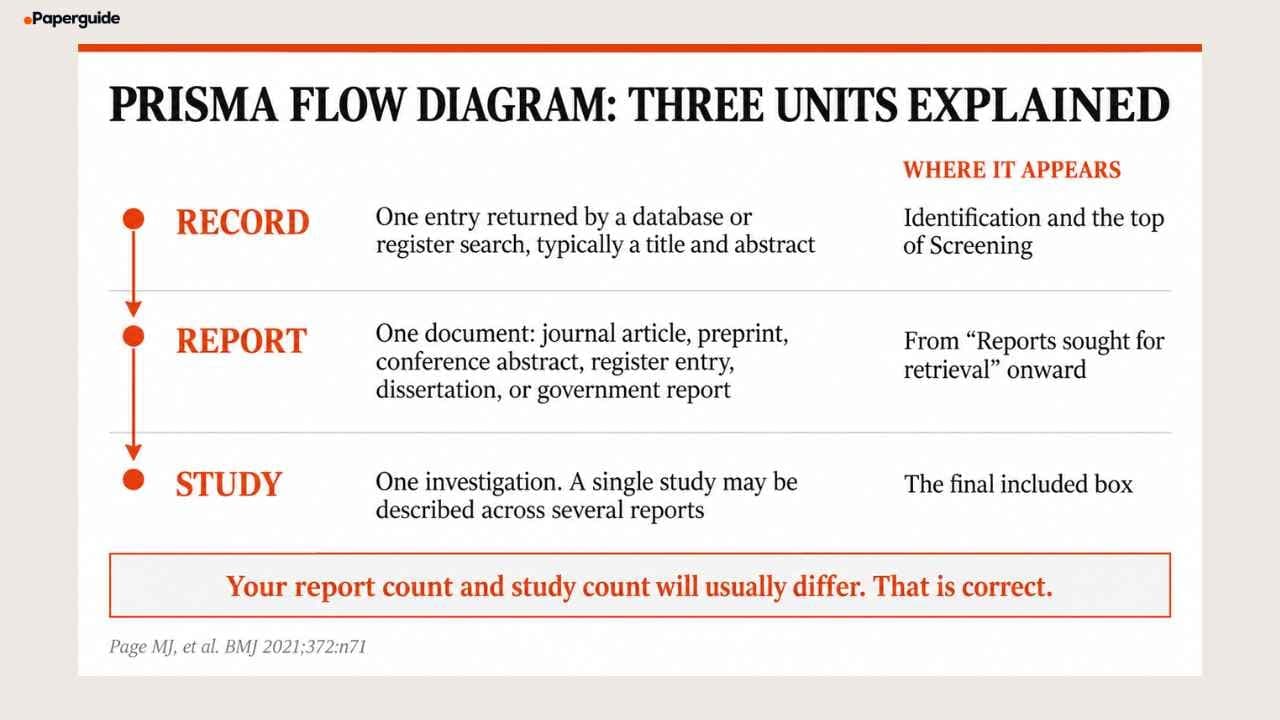
This is the single largest cause of diagrams that do not reconcile, and only a handful of pages on the whole topic address it.
| Unit | What it means | Where it appears |
|---|---|---|
| Record | One entry returned by a database or register search, typically a title and abstract | Identification and the top of Screening |
| Report | One document. A journal article, preprint, conference abstract, register entry, clinical study report, dissertation, unpublished manuscript or government report | From "Reports sought for retrieval" onward |
| Study | One investigation. A single study may be described across several reports | The final included box |
PRISMA 2020 defines a report explicitly and broadly, and the breadth is deliberate: it stops authors from quietly excluding a trial because its only write up was a dissertation [1].
Two consequences follow.
Your report count and study count will usually differ, and that is correct. A trial published as a protocol paper, a primary results paper and a long term follow up is one study and three reports. A diagram ending "24 studies included" and "24 reports of included studies" in a field with heavy multi publication is more likely an error than a coincidence.
The unit changes mid diagram, at "Reports sought for retrieval". Above that line you are counting database entries. Below it you are counting documents. Screening 2,400 records and then seeking 80 reports is normal. Screening 2,400 and seeking 2,400 means something went wrong upstream.
How the Diagram Relates to the Checklist
The diagram and the 27 item checklist describe the same review from different angles, and they meet at one item.
| Flow diagram | Checklist | |
|---|---|---|
| Reports | Selection process, as counts | Everything else, as prose |
| Size | Three phases, two branches | 27 items, 42 rows |
| Where they meet | Item 16a asks for the selection numbers, ideally as the diagram | Item 16a |
| Format | A figure | A table of pointers |
Because item 16a covers the same numbers the figure shows, the counts in your diagram, the counts in your Results text and the counts on your completed checklist all have to agree. Three descriptions of one process, and a reviewer can check them against each other in a minute.
When You Need One, and When You Do Not
| Review type | Diagram required | Notes |
|---|---|---|
| Systematic review | Yes | The core case. Most journals treat it as a submission condition |
| Meta analysis | Yes | Same diagram. Selection is reported identically |
| Scoping review | Yes, under PRISMA ScR | The extension carries its own guidance [4] |
| Umbrella review | Yes | Applied at the level of included reviews rather than primary studies |
| Rapid review | Yes, adapted | No dedicated extension. Report your shortcuts explicitly |
| Narrative review | No | PRISMA does not apply |
| Traditional literature review | No | A predefined reproducible search is the dividing line |
The judgement call most people face is narrative versus systematic. If your search was predefined, reproducible and exhaustively documented, the diagram applies. If you selected sources by expertise and judgement to build an argument, it does not.
Adding a flow diagram to a review that was not conducted systematically does not make it systematic. It makes the reporting inaccurate. The same test decides whether the wider PRISMA reporting guidelines apply to your write up at all.
What a Good Diagram Looks Like
Six properties, all visible without reading the methods.
Three phase labels, not four.
Per source identification counts, so a reader can see the balance between databases and registers.
A three way removal split at the top, showing what was duplicated, what was automated out, and what went for other reasons.
Exclusion reasons that sum to the excluded total. This is the first thing a methods reviewer checks.
Different report and study counts at the bottom, unless the field genuinely has no multi publication.
No orphan numbers. Every figure subtracted from a box appears in another box. The arithmetic that has to close is part of what the PRISMA reporting steps walk through.
Common Mistakes
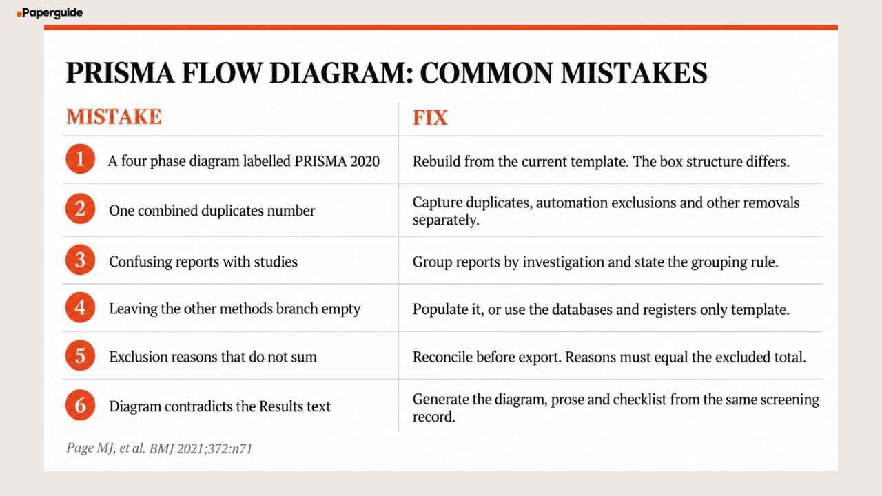
Mistake 1: A Four Phase Diagram Labelled PRISMA 2020
The most visible error, because a reader spots it before reading a word.
Fix: rebuild from the current template. Do not relabel the old one, because the box structure differs too.
Mistake 2: One Combined Duplicates Number
Collapsing duplicates, automation exclusions and other removals into a single figure hides how much screening was done by software.
Fix: capture the three numbers separately during deduplication.
Mistake 3: Confusing Reports With Studies
Reporting the same figure for both is correct only when no study was described in more than one document.
Fix: group reports by investigation and state the grouping rule in the methods.
Mistake 4: Leaving the Other Methods Branch Empty
Zeros throughout the right branch tell a reader you did no citation searching.
Fix: populate it, or delete it and use the databases and registers only template.
Mistake 5: Exclusion Reasons That Do Not Sum
A gap between the listed reasons and the excluded total means a category is missing.
Fix: reconcile before export, and add an "other, with reasons stated in the text" line for genuine edge cases.
Mistake 6: A Diagram That Contradicts the Results Text
The figure, the prose and the checklist describe one process and must agree.
Fix: generate all three from the same screening record.
Quality Checklist
- [ ] Three labelled phases: Identification, Screening, Included, with no separate Eligibility band
- [ ] Records identified reported per source where feasible
- [ ] Pre screening removals split three ways: duplicates, automation, other
- [ ] Automated exclusions separated from human exclusions at the records excluded box
- [ ] Every arrow out of a box lands in a named box
- [ ] Exclusion reasons sum exactly to the reports excluded total
- [ ] Reports and studies counted as distinct units at the final box
- [ ] The other methods branch is populated or removed, never zeroed
- [ ] Diagram counts match the Results text and the completed checklist
- [ ] The template is cited, satisfying the CC BY 4.0 attribution condition
Try It Yourself (2 Minutes)
- Open two recent systematic reviews and look only at their flow diagrams. Count the phase labels, then check whether the exclusion reasons sum to the excluded total. You will find at least one that does not.
- Pick one of those reviews and compare its diagram against its Results text. Check whether the records screened, reports assessed for eligibility, and studies included match between the figure and the prose. Where the two disagree, you have found the reporting gap the diagram exists to prevent.
- If you are running your own systematic review, build the figure directly in Paperguide's free PRISMA flow diagram generator. It walks you through each box, ensures the counts reconcile before you export, and fits into Paperguide's broader systematic review workflow so your screening data, literature review, and flow diagram stay connected in one workspace.
This takes about two minutes and it turns an abstract reporting requirement into a check you can run on any review you read or write.
Conclusion
The PRISMA flow diagram is a narrow instrument answering a narrow question: how did this review get from a search result to a set of included studies, and can a reader follow the path. Three phases, two branches, one convergence, every number accounted for.
Most of the difficulty is conceptual rather than technical. The unit changes partway down the figure, reports and studies are not interchangeable, and the right hand branch exists for a reason. A correct flow diagram supports transparent reporting of study selection, but it does not by itself demonstrate compliance with all PRISMA 2020 items or establish that the review methods were appropriate.
Frequently Asked Questions
What is a PRISMA flow diagram?
A figure that records how many records a systematic review found, how many were removed at each stage and why, and how many studies were finally included. It is one of the components of the PRISMA 2020 statement alongside the 27 item checklist, and its purpose is to let a reader trace every included study back to the original search [1].
What are the benefits of a PRISMA flow diagram?
It makes study attrition visible, exposes reporting gaps before a reviewer finds them, gives readers an immediate quality signal, makes the review easier for a future team to update, and disciplines how carefully screening decisions are recorded in the first place. Journals treat it as a submission condition, but the methodological benefits arrive earlier than submission.
How many phases does the PRISMA 2020 flow diagram have?
Three: Identification, Screening and Included. The 2009 version had four, adding Eligibility as a separate band. In 2020 the eligibility boxes moved inside Screening, so guides describing a four phase diagram are describing the retired version [1] [2].
What is the difference between records, reports and studies?
A record is one entry returned by a database or register search. A report is one document, defined broadly by PRISMA to include journal articles, preprints, conference abstracts, register entries, dissertations and government reports. A study is one investigation, which may be described across several reports. The diagram counts records at the top, reports from the retrieval box onward, and studies at the very bottom.
Why do the report count and study count differ at the bottom?
Because one study can be described in several documents. A trial published as a protocol paper, a results paper and a long term follow up is one study and three reports. In fields with heavy multi publication, identical report and study counts are more likely to indicate an error than a coincidence.
What is the right hand branch of the diagram for?
Sources other than databases and registers: citation searching, grey literature, organisational websites and author contact. It has its own retrieval, eligibility and exclusion boxes but no bulk screening box, because records found this way are not screened as a set. If you did not search other sources, remove the branch rather than filling it with zeros.
Is a PRISMA flow diagram required for publication?
Not by any regulator, but most journals in health, medical and increasingly social science fields either require or strongly recommend it for systematic reviews. Compliance is a floor rather than a distinction: a complete diagram removes one class of reason for rejection, but it says nothing about whether the review was well conducted.
Do scoping reviews need a flow diagram?
Yes. Scoping reviews report under PRISMA ScR, which carries its own flow diagram guidance. The selection process still has to be traceable; what differs is that a scoping review does not perform the critical appraisal several core PRISMA items assume [4].
References
- Page MJ, McKenzie JE, Bossuyt PM, et al. "The PRISMA 2020 statement: an updated guideline for reporting systematic reviews." BMJ, 372:n71, 2021.
- Moher D, Liberati A, Tetzlaff J, Altman DG. "Preferred reporting items for systematic reviews and meta-analyses: the PRISMA statement." PLoS Medicine, 6(7):e1000097, 2009.
- Page MJ, Moher D, Bossuyt PM, et al. "PRISMA 2020 explanation and elaboration: updated guidance and exemplars for reporting systematic reviews." BMJ, 372:n160, 2021.
- Tricco AC, Lillie E, Zarin W, et al. "PRISMA Extension for Scoping Reviews (PRISMA ScR): Checklist and Explanation." Annals of Internal Medicine, 169(7):467-473, 2018.
Running a review?
Run your systematic review in Paperguide
Dual screening, verifiable extraction and PRISMA reporting in one place.
Start a reviewNo credit card required